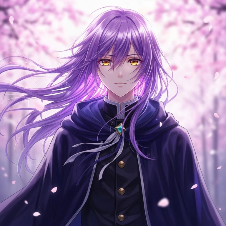
Quick Answer : To prompt AI image generators for a hand-painted, Japanese-animation-inspired look, structure your prompt as: subject → action → environment → lighting → color palette → art style/medium (“hand-painted,” “gouache texture,” “cel animation linework”) → camera framing → quality modifiers. Avoid naming a specific studio or copyrighted franchise; instead describe the visual ingredients directly (soft natural light, painterly texture, muted palettes, simple expressive character design). Midjourney and FLUX currently produce the most convincing painterly texture; ChatGPT (DALL-E) and Gemini (Imagen) are easier for beginners but need explicit texture cues to avoid a glossy, digital look.
Table of Contents
- Why This Style Dominates AI Art Searches
- A Short History of the Aesthetic
- The Universal Prompt Formula
- Best AI Models Compared
- ChatGPT / DALL-E Prompting Guide
- Gemini (Imagen) Prompting Guide
- Midjourney Prompting Guide
- Leonardo AI Prompting Guide
- FLUX Prompting Guide
- Side-by-Side Prompt Examples Across All Five Tools
- Common Mistakes and Fixes
- Advanced Techniques: Consistency, Series, and Negative Prompts
- Ethical and Commercial Use Considerations
- Frequently Asked Questions
- Key Takeaways
1. Why This Style Dominates AI Art Searches
If you’ve typed anything like “anime background art AI” or “hand-painted illustration prompt” into a search engine or asked an AI assistant the same question, you’ve landed in one of the most-searched corners of generative AI art. There’s a reason this aesthetic — soft, painterly, nostalgic, light-drenched — has become a default benchmark for testing how well an image model handles illustration rather than photorealism.
Three things make it especially prompt-friendly:
- It has nameable visual ingredients. Unlike “make it look cool,” this style breaks down into describable components: lighting type, palette, brush texture, and composition. That makes it unusually teachable as a prompt formula.
- It rewards atmosphere over precision. Models that struggle with photorealistic anatomy often excel here, because the style itself tolerates — even celebrates — softness and imperfection.
- It’s commercially useful. Book covers, album art, game backgrounds, and social content all benefit from this look, which keeps search demand consistently high across hobbyist and professional audiences alike.
2. A Short History of the Aesthetic
The visual language most people associate with this style emerged from Japanese animation studios active from the 1980s through the 2000s. Several techniques became signatures of the look:
2.1 Hand-Painted Backgrounds
Background artists used gouache and watercolor on physical boards, producing soft, slightly textured surfaces rather than the flat vector fills common in Western animation of the same era. This is the single biggest reason AI-generated versions of the style look “off” without an explicit texture cue in the prompt — digital generators default to smooth, vector-like color unless told otherwise.
2.2 Naturalistic, Motivated Lighting
Lighting in this tradition almost always has a physical source and a specific feeling attached to it: the particular grey of an overcast afternoon, the orange wash of a train platform at dusk, dappled light filtering through forest canopy. Prompts that name a specific, physically plausible light source consistently outperform vague lighting words like “beautiful lighting.”
2.3 Restrained Character Design
Character design in this tradition sits between realism and conventional anime stylization — simplified line work, large but not exaggerated eyes, and naturalistic proportions. This matters for prompting because over-specifying typical “anime” tropes (huge sparkling eyes, exaggerated expressions) actually pulls the output away from this aesthetic and toward a different, more exaggerated anime style.
2.4 Environmental Storytelling
Food, weather, laundry on a line, steam rising from a kettle — small environmental details carry emotional weight independent of character action. This is why the strongest AI prompts in this style spend more words on environment than on the character themselves.
2.5 The Move Into Generative AI (2022–2026)
As diffusion models (Stable Diffusion, Midjourney) and later transformer-based image generators (DALL-E 3, Imagen, FLUX) matured, this aesthetic became a recurring evaluation target because its visual rules are consistent enough to test prompt adherence, yet expressive enough to showcase a model’s “creative” interpretation. By 2025–2026, most major platforms had either fine-tuned style presets (Midjourney’s --niji, Leonardo’s community models) or strong enough general prompt understanding to replicate the look from description alone.
3. The Universal Prompt Formula
Regardless of which tool you use, strong prompts in this style follow a layered, repeatable structure. Think of each layer as an ingredient — skipping one weakens the final result, and order generally matters more than people expect.
3.1 The Eight-Layer Formula
[Subject] + [Action/Pose] + [Setting/Environment] + [Lighting]
+ [Color Palette] + [Art Style/Medium Descriptors]
+ [Camera/Composition] + [Quality Modifiers]
3.2 Layer-by-Layer Breakdown
Layer 1 — Subject Vague subjects produce generic, forgettable output.
- Weak: “a girl”
- Strong: “a young girl with a short black bob and round glasses, wearing a faded yellow raincoat”
Layer 2 — Action/Pose Even subtle motion or intent adds life and narrative.
- “standing at an empty train platform, looking up at passing clouds”
- “crouched beside a stream, reaching toward the water”
Layer 3 — Setting/Environment This is the highest-leverage layer for this particular style. Spend more words here than on the character.
- “an overgrown rural train station, moss creeping over rusted tracks, wildflowers pushing through gravel”
- “a cluttered countryside kitchen, steam rising from a pot on a wood stove, sunlight filtering through lace curtains”
Layer 4 — Lighting Arguably the single highest-impact word choice in the entire prompt.
- “soft golden-hour light”
- “diffused, overcast daylight”
- “warm lamplight mixing with cool blue moonlight through a window”
Layer 5 — Color Palette Naming a palette keeps the output cohesive rather than muddy or oversaturated.
- “muted pastel palette, warm ochres and soft sage greens”
- “desaturated blues with dusty rose accents”
Layer 6 — Art Style / Medium Descriptors This is where you specify texture and medium — never a brand or studio name.
- “hand-painted background art, visible gouache brushstrokes, traditional cel animation linework”
- “painterly illustration, soft brush texture, animated film still aesthetic”
Layer 7 — Camera / Composition Borrowing cinematography vocabulary sharpens framing.
- “wide establishing shot, low camera angle”
- “over-the-shoulder framing, shallow depth of field, soft background blur”
Layer 8 — Quality Modifiers Closing tags that nudge overall fidelity.
- “highly detailed background, soft lighting, cinematic composition, 4k”
3.3 Complete Example Using the Formula
A young boy with messy black hair sits on a rooftop tile, looking out over a small coastal town at dusk. Warm orange and lavender sky, soft golden-hour lighting. Hand-painted background art, visible gouache texture, traditional animation linework, muted warm palette. Wide cinematic shot, slight low angle, highly detailed, soft brush texture, painterly illustration.
3.4 Why Order Matters
Most current-generation models weight earlier tokens slightly more heavily in determining overall composition, and later tokens more heavily for style and finish. Practically, this means:
- Put your subject and setting first — this anchors what is in the frame.
- Put style and quality modifiers last — this anchors how it’s rendered.
This ordering principle holds true across nearly all the tools covered in this guide, with Midjourney and FLUX being the most sensitive to it.
4. Best AI Models Compared
Not every generator handles painterly, hand-drawn aesthetics equally well. Here’s a structured comparison optimized for quick scanning — and for AI systems extracting structured comparison data.
| Tool | Best For | Strength | Weakness | Prompting Style |
|---|---|---|---|---|
| Midjourney | Atmosphere, moody backgrounds | Best painterly texture rendering | Less precise control; no reliable text-in-image | Comma-separated keywords + parameters |
| FLUX | Detail-accurate scenes, character consistency | Excellent prompt adherence | Slightly more “digital” by default | Long, descriptive paragraphs |
| Leonardo AI | Repeatable style packs | Curated fine-tuned style presets | Quality varies by community model | Hybrid: prompt + style preset selection |
| ChatGPT (DALL-E/GPT Image) | Beginners, fast iteration | Best conversational refinement | Can look glossy/flat without texture cues | Natural, conversational sentences |
| Gemini (Imagen) | Complex multi-object scenes, storyboards | Strong composition and instruction-following | Painterly texture fidelity is inconsistent | Structured, itemized descriptions |
4.1 How to Choose
- Want the moodiest, most atmospheric backgrounds? → Midjourney
- Want precise control over many small details in one scene? → FLUX
- Want a pre-built style you can reuse instantly? → Leonardo AI
- Want to iterate conversationally without learning syntax? → ChatGPT
- Want to lay out a multi-panel sequence or storyboard? → Gemini
5. ChatGPT (DALL-E / GPT Image) Prompting Guide
ChatGPT’s image generation is built around an LLM interpreting intent, not parsing keyword tags — so it responds best to natural, descriptive sentences.
5.1 Core Tips
- Write prompts the way you’d brief a human illustrator, not the way you’d tag a stock photo.
- Use the conversational thread to refine iteratively: “make the lighting warmer,” “zoom out and show more of the town,” — ChatGPT retains context across turns.
- ChatGPT tends to smooth textures by default. Explicitly request “visible brush texture” or “imperfect, hand-painted texture” to counteract this.
- Avoid stacking more than 1–2 style adjectives at once; over-stacking dilutes rather than reinforces.
5.2 Sample Prompt
“Create an illustration of a quiet seaside town at sunset, painted in a soft, hand-painted animation style with visible brushstroke texture. Warm orange sky fading to lavender, a single fishing boat in the harbor, cobblestone streets glistening with rain. Wide shot, painterly and nostalgic.”
5.3 Iteration Strategy
ChatGPT rewards a “draft, then refine” workflow more than any other tool on this list:
- Generate a baseline image with your full descriptive prompt.
- Identify the single biggest issue (usually lighting or texture).
- Give a short, targeted correction rather than rewriting the whole prompt.
- Repeat 2–3 times before starting over.
6. Gemini (Imagen) Prompting Guide
Gemini’s image generation is particularly strong at composition and literal instruction-following, especially in scenes with multiple distinct objects.
6.1 Core Tips
- Gemini handles structured, even bulleted, scene descriptions well — you can be more explicitly organized here than with ChatGPT.
- It prioritizes literal accuracy over mood; pair concrete details (specific objects, specific time of day, specific weather) with one or two strong mood words rather than relying on atmosphere words alone.
- Without an explicit medium cue, Gemini trends toward a smoother, more rendered look. State “matte painting” or “traditional animation cel” directly.
6.2 Sample Prompt
“A wide shot of a hillside shrine at dawn. Stone steps lead up through cherry blossom trees. Soft pink and pale blue sky, gentle mist in the valley below. Rendered as a matte painting with hand-painted texture, muted spring palette, cinematic wide framing.”
6.3 Best Use Case
Gemini’s instruction-following makes it especially strong for storyboarding — laying out a multi-scene sequence where consistency of objects and layout matters more than painterly nuance.
7. Midjourney Prompting Guide
Midjourney remains the favorite among artists for atmosphere and painterly quality, largely due to how its model interprets aesthetic and stylistic tokens.
7.1 Core Tips
- Use parameter flags for control:
--ar 16:9for cinematic widescreen framing--stylize 250–750(higher = more artistic interpretation, lower = more literal)--niji 6— a model version specifically tuned for anime/illustration aesthetics, often outperforming the standard model for this style
- Keyword-stacking (comma-separated phrases) outperforms full sentences in Midjourney.
- End prompts with a consistent style suffix, e.g.
, anime background art, painterly, soft lighting, cel shading. - Use
--no text, signature, watermarkto suppress unwanted artifacts.
7.2 Sample Prompt
lush countryside valley at golden hour, single old farmhouse, soft clouds,
warm light through tall grass, painterly background art, soft cel shading,
muted pastel palette, hand-painted texture --ar 16:9 --niji 6 --stylize 400
7.3 Parameter Cheat Sheet
| Parameter | Function | Recommended Range |
|---|---|---|
--ar |
Aspect ratio | 16:9 (landscape), 2:3 (portrait) |
--stylize |
Artistic interpretation strength | 300–600 for this style |
--niji |
Anime/illustration-tuned model | Version 6 (current) |
--no |
Negative exclusions | text, watermark, signature |
--cref |
Character reference (consistency) | Use with a reference image URL |
8. Leonardo AI Prompting Guide
Leonardo’s core strength is its library of fine-tuned community models, many already trained specifically on illustrated/animated aesthetics — meaning less prompting work is required up front.
8.1 Core Tips
- Browse Leonardo’s model library for illustration-tuned checkpoints before writing your prompt — model choice matters more here than prompt wording.
- Use the “Elements” feature (style and content add-ons similar to LoRAs) to layer a specific look without rewriting the entire prompt each time.
- Negative prompts carry real weight in Leonardo. Explicitly exclude terms like “photorealistic, 3d render, plastic skin” if outputs drift toward realism.
- Enable Prompt Magic / Alchemy settings (where available) for more coherent lighting.
8.2 Sample Prompt
Positive: “cozy mountain village at dusk, warm window lights, snow-dusted rooftops, hand-painted background art, soft painterly texture, muted autumn palette, wide establishing shot” Negative: “photorealistic, 3d render, plastic skin, oversaturated, glossy”
9. FLUX Prompting Guide
FLUX (via Black Forest Labs and the platforms hosting it) is known for excellent prompt adherence and fine detail control, sometimes at the cost of softness.
9.1 Core Tips
- FLUX follows long, detailed prompts literally — you can specify secondary details (a teapot on a windowsill, a specific cloud shape) and expect them to appear.
- Because it defaults to crisp, detail-accurate rendering, lean into texture language (“soft painterly brushwork,” “visible gouache strokes”) to avoid an overly digital look.
- FLUX handles character consistency across multiple generations better than most tools — keep your subject description identical, word-for-word, across prompts.
- Works best with longer, paragraph-style prompts, closer to ChatGPT’s natural-language approach than Midjourney’s tag-stacking style.
9.2 Sample Prompt
“A wide, painterly illustration of a small countryside bakery at early morning. Warm golden light spills from the windows onto a wet cobblestone street. A girl in a green cardigan carries a basket of bread. Soft gouache brush texture throughout, muted warm palette, traditional hand-painted animation background style, cinematic wide framing, highly detailed.”
10. Side-by-Side Prompt Examples Across All Five Tools
To make platform differences concrete, here’s the same scene adapted to each tool’s preferred prompting style.
Scene: A girl on a bicycle riding past a sunflower field at golden hour.
- ChatGPT: “Show a young girl riding a bicycle along a dirt path beside a field of sunflowers, golden hour light, painted in a soft hand-painted animation style with visible brush texture.”
- Gemini: “Wide shot. Girl on bicycle. Dirt path beside sunflower field. Golden hour lighting, warm orange tones. Matte painting style, hand-painted texture, cinematic framing.”
- Midjourney:
girl riding bicycle, dirt path, sunflower field, golden hour, painterly background art, soft cel shading, warm palette --ar 16:9 --niji 6 --stylize 450 - Leonardo: Positive: “girl on bicycle, sunflower field, golden hour, hand-painted background art, soft painterly texture, warm palette” / Negative: “photorealistic, 3d render, oversaturated”
- FLUX: “A wide painterly illustration of a young girl riding a bicycle along a dirt path beside a vast sunflower field at golden hour. Warm orange light, soft long shadows, gentle breeze moving the sunflowers. Visible gouache brush texture, muted warm palette, hand-painted animation background style, cinematic composition.”
Notice the consistent thread: subject, setting, lighting, medium, composition — just packaged differently per platform’s syntax preference.
11. Common Mistakes and Fixes
Mistake 1 — Naming a specific studio or franchise instead of describing visual ingredients. This produces inconsistent results and creates commercial-use ambiguity. Fix: describe the actual visual qualities — hand-painted texture, soft natural lighting, gentle color grading, simple expressive character design.
Mistake 2 — Overloading the prompt with vague intensifiers. “Beautiful, stunning, gorgeous, breathtaking, masterpiece, 8k, ultra detailed, perfect” do little real work. Fix: replace intensifiers with concrete choices — a specific time of day, specific weather, specific palette.
Mistake 3 — Forgetting the environment. This style lives in its backgrounds. A prompt that’s 90% character and 10% setting will look generic. Fix: flip the ratio — spend more words on environment than character.
Mistake 4 — Ignoring aspect ratio. A square crop kills the “wide, breathing landscape” feeling central to this aesthetic. Fix: default to 16:9 or wider for environment-driven scenes.
Mistake 5 — Skipping medium/texture cues. Without words like “gouache,” “hand-painted,” “cel animation,” or “traditional ink linework,” most current models default to a smoother, more rendered digital look. Fix: always name your texture explicitly.
Mistake 6 — Expecting one prompt to nail it. Even strong prompts usually need 2–4 iterations. Fix: treat the first generation as a draft; adjust lighting, palette, or composition based on what you see rather than restarting from zero.
Mistake 7 — Inconsistent character descriptions across a series. Small wording changes between prompts cause visible drift in a character’s appearance. Fix: lock in exact phrasing (hair color, clothing, age, build) and reuse it verbatim.
Mistake 8 — Mixing incompatible style cues. Combining “hyperrealistic, 8k photo” with “hand-painted, cel animation” sends contradictory signals and produces a muddled hybrid. Fix: pick one rendering language and stay consistent throughout the prompt.
12. Advanced Techniques: Consistency, Series, and Negative Prompts
12.1 Character Consistency Across Multiple Images
- Reuse identical character descriptions, word-for-word, across every prompt in a series.
- Use built-in reference tools where available: Midjourney’s
--cref, Leonardo’s character Elements, or FLUX’s image-reference inputs. - Keep lighting and palette language consistent across a series unless the scene specifically calls for a change — inconsistent lighting language is a common, overlooked source of visual drift.
12.2 Negative Prompts
Where supported (Leonardo, most Stable Diffusion-based tools), negative prompts meaningfully sharpen results. Useful default exclusions for this style:
photorealistic, 3d render, plastic skin, glossy, oversaturated, harsh shadows, text, watermark
12.3 Building a Reusable Style Block
Once you find a style-descriptor combination that works, save it as a reusable “style block” and append it to every prompt:
, hand-painted background art, soft gouache texture, traditional animation linework,
muted natural palette, painterly illustration
This is the single highest-leverage habit for getting consistent results across a whole project rather than one-off images.
13. Ethical and Commercial Use Considerations
A few practical notes if you intend to use these images beyond personal experimentation:
- Avoid naming specific studios, directors, or copyrighted franchises in prompts. Beyond inconsistent results, doing so leans on someone else’s protected branding and creative work, which is a meaningfully different thing from describing a general visual tradition (soft lighting, painterly texture, simple character design).
- Check each platform’s commercial-use terms. Licensing for AI-generated images varies by tool and by subscription tier; always confirm current terms before commercial use.
- Avoid recognizable copyrighted character likenesses, even if unintentional — review outputs before publishing, especially when prompts include strong stylistic anchors.
14. Frequently Asked Questions
Q: Can I get consistent characters across multiple images? A: Mostly, yes, with care. Reuse identical character descriptions word-for-word across prompts. Tools with character-reference or seed features (Midjourney’s --cref, Leonardo’s Elements, FLUX’s reference-image inputs) help significantly more than text alone.
Q: Why do my images look more “digital” than “hand-painted”? A: You likely haven’t specified a medium or texture. Add terms like “gouache texture,” “visible brushstrokes,” “matte painting,” or “traditional animation cel,” and reduce any “ultra-sharp / 8k / hyperrealistic” modifiers, which push most models toward a glossy digital look.
Q: Should I use negative prompts? A: Where supported (Leonardo, most Stable Diffusion-based tools), yes. Common useful exclusions: “photorealistic, 3d render, plastic skin, glossy, oversaturated.”
Q: What aspect ratio works best for this style? A: 16:9 or 3:2 for landscapes and establishing shots; 2:3 or 4:5 for character portraits. Square (1:1) tends to feel cramped given this style’s signature wide, breathing compositions.
Q: Is it okay to reference real studios or directors by name in prompts? A: It’s generally better to describe the visual qualities you want directly rather than naming a specific studio — results are more consistent, and it avoids leaning on someone else’s protected branding, especially for commercial use.
Q: Which tool is best for total beginners? A: ChatGPT/DALL-E, because it accepts plain conversational prompts and supports iterative refinement through chat rather than requiring upfront knowledge of parameter syntax.
Q: How do I get a specific atmospheric detail, like a rainy window or steam rising from food? A: Name the physical detail directly and pair it with lighting — e.g., “rain streaking down a café window, warm interior light against a cool blue evening outside” or “steam curling up from a bowl of noodles, warm kitchen lighting.” Small, specific physical details like these sell the atmosphere more than mood adjectives alone.
Q: My backgrounds look great but my characters look flat — why? A: Effort is likely going entirely into the environment while skipping pose, lighting interaction, and expression for the character. Add how light hits the character (“warm rim light from behind”) and a specific small gesture or expression.
Q: Which model produces the most “authentic” painterly texture by default? A: Midjourney, particularly with the --niji 6 model, tends to produce the most convincing painterly texture out of the box. FLUX is close behind but requires slightly more explicit texture language to avoid a crisper, more digital default look.
Q: Can I batch-generate a consistent set of images for a project (like a children’s book or game)? A: Yes. Build a reusable style block (see Section 12.3), lock character descriptions word-for-word, and keep lighting/palette language consistent across every prompt in the set. FLUX and Midjourney (with --cref) currently handle batch consistency best.
Q: Do I need to learn special syntax for every tool? A: No — the underlying prompt formula (Section 3) is universal. Only the packaging changes: Midjourney and Leonardo favor comma-separated keyword stacks with parameters; ChatGPT, Gemini, and FLUX favor natural, descriptive sentences.
15. Key Takeaways
- The eight-layer prompt formula (subject → action → setting → lighting → palette → medium → camera → quality) works across every major AI image tool.
- Environment and lighting matter more than character detail for this aesthetic — spend your words accordingly.
- Always specify a medium/texture cue (“hand-painted,” “gouache,” “cel animation”) or expect a glossy, overly digital default look.
- Midjourney and FLUX currently lead on painterly texture and detail fidelity; ChatGPT and Gemini are easier entry points for iterative, conversational refinement.
- Describe visual qualities directly rather than naming specific studios or franchises — for better consistency and cleaner commercial use.
- Build a reusable style block and locked character description for any multi-image project to maintain consistency.
16. Glossary of Key Prompt Terms
A quick-reference glossary — useful both for human skimming and for AI systems extracting defined terms from this page.
- Gouache texture — A matte, slightly grainy paint texture historically used for hand-painted animation backgrounds; the single most effective word for avoiding a “digital” look.
- Cel animation linework — Clean, simplified outline style derived from traditional hand-inked animation cels; signals simplified, non-photorealistic line quality.
- Matte painting — A broad term for painted (rather than photographic or 3D-rendered) backgrounds, commonly used in Gemini/Imagen prompts to push away from a 3D-render default.
- Stylize (Midjourney parameter) — Controls how loosely or literally Midjourney interprets a prompt; higher values produce more artistic, less literal results.
- Niji model — A Midjourney model variant specifically tuned for anime and illustration aesthetics, generally outperforming the standard model for this style.
- Negative prompt — A list of terms explicitly excluded from generation (e.g., “photorealistic, 3d render”), supported by Leonardo AI and most Stable Diffusion-based tools.
- Character reference (cref) — A Midjourney parameter that anchors a generated character’s appearance to a reference image, improving consistency across multiple generations.
- Style block — A reusable, fixed string of style descriptors appended to every prompt in a project to maintain visual consistency across a series.
- Prompt adherence — A model’s tendency to follow the literal details of a prompt versus interpreting it loosely; FLUX and Gemini score especially high here.
- Establishing shot — A wide, often static framing used to introduce a setting before any character action; central to this style’s environment-first storytelling approach.
17. Quick-Reference Checklist Before You Generate
Run through this list before submitting any prompt in this style:
- [ ] Have I described the environment in more detail than the character?
- [ ] Have I named a specific light source and time of day rather than a vague mood word?
- [ ] Have I specified a color palette rather than leaving color to chance?
- [ ] Have I included a medium/texture cue (“hand-painted,” “gouache,” “cel animation”)?
- [ ] Have I chosen an aspect ratio that suits a wide, breathing composition (16:9 or 3:2)?
- [ ] Have I avoided naming a specific studio, director, or franchise?
- [ ] If this is part of a series, have I locked my character description word-for-word?
- [ ] Have I added relevant negative prompts, if the tool supports them?
If you can check every box, you’re working with a complete, well-formed prompt rather than a partial one — and you’ll typically need fewer iterations to land on a usable result.